Advanced Settings
Button Filters
Button filters are very useful on all sorts of apps. Imagine you have a CRM and you have a button that you only want to show on Company pages and another button that you only want to show on Person pages - this is where filters come in.
Show On
There are 3 options for Show On:
- Everywhere - this is the default setting and will make sure your button shows on every page in this app.
- Only On - choose this when you want the button to show only on pages that match a specific URL. For example, only on Company pages in a CRM or only in specific projects in Jira or only on specific boards in Trello, etc.
- Everywhere Except - the opposite of Only On - choose this to have this button show on every page of the app except when it matches a certain URL
Pages That Match (URL)
The Pages That Match field uses Regular Expressions to filter out pages.
Here are some handy examples:
- LinkedIn - notice that each profile has
/in/in the URL. For example,https://www.linkedin.com/in/someprofile/. So if you want a button to show only on people's profiles, simply put/in/into the Pages That Match field. Similarly, you can put/company/to filter only companies. - Trello - notice that each board has the board ID in the URL. For example,
https://trello.com/b/ABC123/board-name. So if you want a button that shows up on cards but only on a specific board, you can put/ABC123/into the Pages That Match field.
When fine-tuning this filter, it's useful to use a regular expression tester like https://regex101.com/ - put the URL from your app into the Test String field and put your filter into the Regular Expression field and see if it matches. Note that you don't need to add slashes (/) to this field, but they help make your filter more specific. For example, on LinkedIn, if your filter was simply in, it would match every page since all of them have an "in" - https://www.linkedin.com/
Pages That Have (CSS selector)
The Pages That Have field uses Query Selectors to filter out pages.
Here are some handy examples:
- LinkedIn - the little green Premium Member badge is wrapped in a
spanwith the class.pv-member-badge. So if you wanted to show a button only on premium members, you can set this field to.pv-member-badge. - Trello - when a card is opened on top of a board, the
divthe card is in has the class.card-detail-window. So if you wanted a button to show only when a card is open, you'd set the Pages That Have field to.card-detail-window.
These selectors can get very specific and very fancy - check out the link to the selector documentation above.
Button Placement
Placement Position
There are 2 options for Placement Position:
- End (default) - at the end of chosen container.
- Start - at the start of chosen container.
Placement Display
There are 2 options for Placement Display:
-
Block (default) - displays an element as a block-level element (similar to <div> or <p>). It starts on a new line and takes up the full width available.
-
Inline - displays an element as an inline element (similar to <span> or <a>). It flows with the surrounding content, taking up only as much width as necessary.
Group
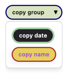
If you have a Grouping Button on the current web page, you can bind one or more buttons to it. To do this, select the Grouping Button you want to bind from the dropdown by choosing its name.


